ISSS608 Visual Analytics
DataViz Makeover 2
In this post, I will critique on one original visualisation designed to reveal the inter- and intra-zonal public bus flows at the planning sub-zone level of January 2022 and propose an alternative for improvement using Tableau.

Take-home Exercise 3
In this take-home exercise 3, I would apply relevant visual analytics techniques and tools for visualising and analysing multidimensional data to create a data visualisation to segment "kid drinks and other" by nutrition indicators.
DataViz Makeover 1
In this post, a population labour participation rate data case applying the fundamentals of Visual Analytics using Tableau will be presented. I will critique the visualisation and propose an alternative for improvement.
Take-home Exercise
Welcome to my practice blog for ISSS608 Visual Analytics Applications, a course module offered in SMU.
Take-home Exercise 2
In this take-home exercise 2, I would apply relevant interactivity and animation methods to create an interactive data visualisation with RStudio.

Take-home Exercise 1
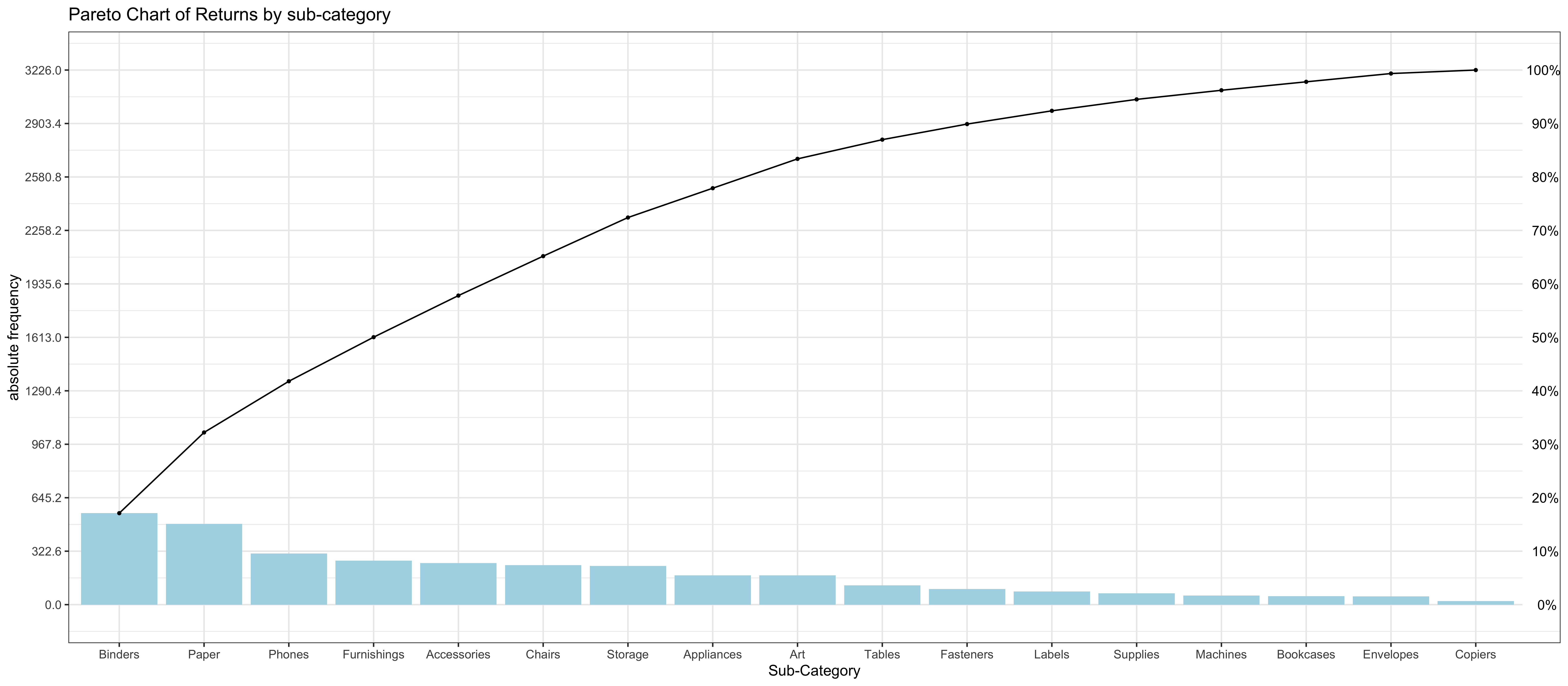
In this take-home exercise, I would apply the skills learnt to create data visualisation by using ggplot2.